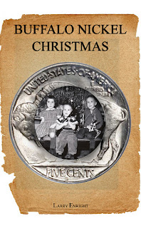
First, the one I chose:
And now, in no particular order, I present some failures...
In this one I tried to combine something "Christmasy" with the Professor (one of the characters) and the nickel (the main story element). Chuck Barris had the gong ready for this one.
This next wasn't so bad, but the photo was muddy and I'm just not that good with Photoshop, other than the hokey stuff I post to Facebook. This one had the five Ryans and the nickel, and I really wanted it to work, but it didn't. The kid on the bottom right was not in the original photo. I copied the kid on the bottom left, flipped him, and changed his hair, hat and arm. Sigh, I liked this one.
This next one was an attempt to combine the normal word (middle scene, which was a photo shot from our house after a huge snow a year or so ago), a magical sky, to represent the magical elements of the story, and the nickel which connects the two. It was too outer spacey, who is second cousin to Kevin Spacey.
Next, is a variation on the last one with a less spacey sky and Santa flying across the top. I still added a surreal background behind the photo from our house, but it just wasn't ringing any sleigh bells for me.
I went dark on this next one, dark foreboding sky, nickel, five kids, Santa flying, but just too dark and the kids in the nickel wasn't working for me.
I changed photos from the five kids and went with this one and the nickel. I liked the picture, but not the layout.
I finally came up with the photo inside the nickel, giving the impression that it was "through" the nickel that the story takes place. I toyed with backgrounds and came up with this old paper one, which was neat.
But when all was said and done, I arrived at this. I'm happy with it.
Feel free to vote. It won't hurt my feelings too much.
If you'd like to read a sample or purchase this book, please visit my website -> Larry's Website of Awesomeness and stuff


2 comments:
Number 3.
I kinda like the one with the professor!
Post a Comment